Friday, 9 July 2010

Monday, 5 July 2010
FINAL PIECE

I decided to use this poster as my final piece because it was my favourite and by far the best out of all the other posters. I Love the whole design i have done of the girl with the medal. The reason she is in alot of pink is because she was supporting breast cancer and it was an image of her doing a sponsored run to raise awareness. I like all of the detail i have included within this image and i am very happy with it. I decided not to include the face because i didn't want to imply that it was just women that got breast cancer or woman at a certain age so i just put writing saying to place your photo here. I like the style of writing i have used here aswell and think the whole layout is good.
The part i don't like about this is the colour of the background and i should have experimented to see which color would go best.
Overall i am really happy with this final piece and i would do this design again if i did a similar project.
Ideas


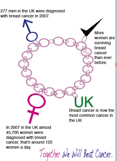
For My first design i thought that doing a charm bracelet would be a very good idea with different charms on it with little bit of information about breast cancer. I like the way i have presented all of my information onto the charm bracelet and how i have managed to copy the breast cancer slogan. The part i dislike about this poster is that even though i only have one image to concentrate on and this is what i wanted it still looks bare and i should have included more information or maybe added something extra onto it. I think that i should have included more color into the poster and made it stand out more.
The second poster i did was the poster with the person holding a rosette and the persons face being cut off. I did this to imply that it doesn't matter whether your male or female or how old you are you could get breast cancer. I liked this idea because it shows that everyone is a winner if they survive breast cancer so thats why i did the woman with the rosette then i wanted to add just a simply amount of text to inform the reader to check themselves. However i think that i could have put more detail into the person and more color into the whole design. I also think that i could have included more color into the text and experimented with it a little bit more.
The third poster i produced was the big picture of the girl and the words "Be A Surviver" underneath to imply that the girl was happy and healthy so it could encourage more people to get checked so they would be the same. I Like the whole idea of this poster as its just simple. I did think that it wouldn't go to plan because i had to draw the girl from illustrator however i am happy with the final piece. The only thing i would change about this poster is the color of the font because i don't think the black font is very appealing.
Research

 These are a few posters i found on the cancer research website and thought that they could help me out with doing my own poster


Tuesday, 18 May 2010
Inglorious Bastards

Sign - A Poster.
Signifiers - The is no color within this layout as it feels like its all been drained out to just dull colors. The only bright color used is the red thats on the bat. This is the main clue about what the film was about so people would automatically think of a violence film because of the image. There is very little writing used only a small sentence to tell the viewers its involved with the nazis then the only other writing used was the title of the film which is a bold font which goes really well with the theme of this poster.
Signified - The whole layout of this posters tells you thats its going to be full of violence and that its also going to be about the war. I think this because there is only one main image on the front of the poster and thats the image of a wooden bat with blood on it and a hat hanging off the edge of it. From looking at this poster you would tell it would appeal more to males than females because of the whole violence aspect. This poster doesn't make me feel happy it makes me feel more uncomfortable and that i would know
Transformers

Sign - A Poster
Signifiers - This poster is simple and doesn't have a lot of information about what it could be promoting or what the film is about. The whole color scheme is really dark and the main colors used are blue, black and white. It shows the image of what could be the earth however it doesn't go into much detail so it could also be seen as any planet. Then it shows an image looking over the object. The image looks like sum sort of robot or creature that is not a human. The font is very basic as well with just the work " Transformers". This title gives no clue about what the whole film could be about for those viewers that haven't heard about the film but have seen the poster. Its also contains the date that the film is released in small writing at the bottom of the page and also in blue writing to contrast with the black and also the color of the robots eye.
Signified - When you look at this image you could automatically assume that there are going to be alot of robots that take over the world because its all so dark and dingy so you think that this creature that is looking over the planet is going to be bad. From the whole image of the robot you think that its going to be an action packed film but a film that contains alot of killing. The main reason i think this is because of the whole color coordination because of the colors they used which are really dark colors and stuck to the same 3 colors throughout the whole layout. But its totally the opposite in the actual film because the transformer is the good guys. If i saw this poster it would make me want to watch the film as its eye-catching and the less information there is the most interesting the films looks.
Up

Sign - A Poster
Signifiers - This poster is really really simple with the whole background as the image of the sky with the clouds and that just the picture of a little house with lots and lots of balloons at the top of it. It also has the title of the film UP in massive lettering which is just a plain font. it also has the creators which is disney pixar in the top right hand corner. Even though most of the image is of the sky it is filled with bright colors with the light blue tones for the sky and also the variety of colors used for the balloons.
They don't use any information on this poster they just have a simple image, then the name of the film and then it will be released.
Signified - I really like this whole layout and think that its really refreshing and really nice to look at. I think the way that there is no information about the film and if you haven't heard anything about the film before and just saw the poster then you would know at all what the film would be about, you would just see the little house with lots of balloons on the top and i think this would attract alot of viewers because they would be intrigued on what the film is about. When i saw this poster i really wanted to see the film as i thought to myself " Why would a house need lots of balloons on top of it ".
Step Up

Sign - A Poster
SIgnifiers - On the poster of Step up it introduces the two main people and shows that the whole film would be about dancing, with the position there in and the way she is leaning on him. The whole color is neutral with yellows, white and black. The whole background is in the middle of the street and i think this shows that the whole dance moves that the couple do is street dancing so it gives the viewer a little indication on what to expect within the film and what to expect.
Signified - When i saw this advertisement for step up i wanted to see the film, because straight away i knew that it would all be about dancing. i think that the whole design of the layout is really nice to look at from the way the couple are positioned on the front as they are doing a really intense dance move. I also like who whole neutral color theme as i think that it all works really well with everything, and think it would make people want to watch it.
30 days of nights

Sign - A Poster
Signifers - The whole layout of this poster is red and black which shows that this film wouldnt be a happy film, and that it would mostly contain violence and gore. At the back of the poster its all red however there are patches of black paint which i think could be seen as splats of blood. The whole layout is really simple and just consists of one image which is of a man who looks angry and from the image you can tell he would either be a vampire or a zombie. I think that this image is of a vampire and thats why he is surrounded by red which would represent the blood that he eats.
Signified - I think that this poster makes me feel like i wouldn't want to watch this film on my own because it looks really gory and that it would be full of blood. This film shows that it wouldn't be a happy film and that there would be lots of violence involved and that alot of people would be killed in it.
Monday, 10 May 2010
SEMIOTICS: The Study Of Signs
Signs
When signs are used this can generally be shown as a unit of meaning, generally shown by words, images, gestures, scents, tastes, textures, sounds. These are essentially all of the ways in which information can be communicated as a message from the company to all of the viewers.
Signifiers
The signifier of the promotional material is basically everything that you would see within the poster or billboard. What the picture and font is any why they may have used this.
Signified
Your general view on the promotional material. Why could they have used the images and font they used and what the basic story tells just by looking at that one image.
When signs are used this can generally be shown as a unit of meaning, generally shown by words, images, gestures, scents, tastes, textures, sounds. These are essentially all of the ways in which information can be communicated as a message from the company to all of the viewers.
Signifiers
The signifier of the promotional material is basically everything that you would see within the poster or billboard. What the picture and font is any why they may have used this.
Signified
Your general view on the promotional material. Why could they have used the images and font they used and what the basic story tells just by looking at that one image.
Tuesday, 4 May 2010
Photography Advert
This advert is based on time lapsed and i think it works really well with the advert. Then though this happens the images that the people are drawing stay at a normal pace and i think this looks really good. I think that this adverts would attract viewers because its not like advert you would normally see and think that its different from all the rest so people would enjoy watching it. and i think that they would talk about this advert to other people so then it would grow more popular.
Provocation Advert
This advert is good for provocation because its a really sad advert and a lot of viewers could find it distressing because it shows the orangoutangs looking unhealthy and sad. However when WWF made this adverts they intended on doing this because it shows the habitats that the orangoutangs now live in and the such poor conditions so then the viewers would feel sorry for the animals and want to sponsor them and give money to the program. They also have a voice over in the background using words that could encourage you to pick up the phone and sponsor the orangoutangs.
Texture Advert
In this Gillette advert they use texture by zooming into the mans face while he's shaving and seeing the hairs on this skin. Then it shows the razor going across it and removing everything that was there. It is showing that it would be the best razor to use because it would be the best thing to use to remove the hairs and also they would remove everything there. i think this is a good way to promote a product because it is persuading the viewer to buy this because its the best. however the only reason i don't think the viewers would pay attention to that part because it is only a diagram sort of part in the advert and if it was more realistic it would look better.
Digital Advert
This citroen advert uses digital all the way through it as they use a 3D image that starts as the car then it changes into a massive robot. The robot then starts dancing around. i like this advert because when you first look at the beginning when you see the car you wouldn't have thought that it would turn into the robot. I think there really good graphics used in this advert because it actually looks like its a real robot dancing and its really good digital work.
Illustration Advert
This Lloyds Tsb advert uses illustration within the advert because throughout the whole thing they have a cartoon feeling throughout however its not like the normally cartoons somebody would see its like they are more human like as they look and act just like humans. I think it is really clever because you don't see a lot of adverts like this that look realistic.
Scale Advert
This Shredded Wheat Advert shows scale in advertisement as they show the man at the beginning talking to the camera. And while he's walking towards the cereal piece he gets smaller and smaller whereas the shredded wheat starts small then it increases in size. Then throughout the rest of the advert he is inside of the cereal telling the viewer the positive things and trying to prove what he's saying is right to persuade the viewer to buy the product.
Tuesday, 20 April 2010
Thirteen ( Alton Towers)
This advertisement Alton Towers did i think was a very good advert and i think it shows in the advert just how scary the ride is. I think that this advert would appeal to any audience apart from little children as i think that it would be too scary for them. however i really think it would appeal to teenagers and adults. This advert throughout the whole avert is dark and dull and uses dark colors such as black, grey and white. It also had music in the background throughout the whole advert which you would see in a horror music which sound like scraping and stuff breaking and its creepy music so i think that the music goes well with the whole advert and would defiantly make people want to try this new ride. in the advertisement is also shows you a preview of the ride and shows people screaming so this would give them a preview look at it and shows them what happens when your on it. i think this is better by showing previews of the ride to show the viewers what they would be dealing with and also what to look forward to.
Sony Bravia
When i first watched this advert i had no idea that it would be sony bravia as its an advert full of firstly soft classical music then it got bigger and bolder with different colors shooting from everywhere. I was so shocked when i realized it was advertising a TV. I this this advert is very cleverly put together and well thought out because even when all the colors are shooting out of the chimneys they are going in tune with the music. i didn't think that the company would use classical music as i thought they would use a song that is very popular at the time as it would be more teenagers and adults they would be interested in the TV and i don't think that this music would attract that audience.
I think this advert is boring and i wouldn't like to sit there and watch it so i think that most teenagers would agree with me so then its an audience which would be missing the advert because they don't find it interesting.
Aero Feel the bubbles.
I Love this advert and think that its absolutely amazing. I think the whole promotional part of this advert works really well as the fact that a lad is skateboarding through a lot of brown balloons that look a lot like chocolate bubbles, and this is exactly what aero was trying to do with this. I think that the music they use with this video goes really well with the whole theme as well with playing the jackson 5 song as it works with the whole skateboarding.
I think that with this advert is would be a very successful advert because it would attract all different age of viewers. it would attract adults with the fact it played the Jackson 5 song so that would make them happy hearing the song that was a big hit when they were teenagers. it would attract teenagers with the skateboarding and and even little children would like it because they are skateboarding through all of the balloons. So if it appeals to all audiences then thats good because they would get more viewers watching their advert and want them to buy their product.
Subscribe to:
Posts (Atom)